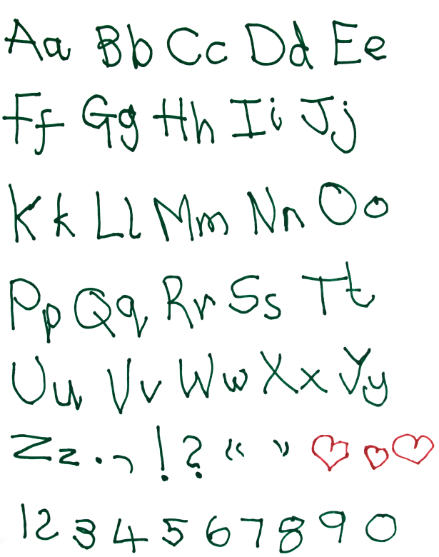
 I've always been envious of those with nice handwriting or even distinctive printing. I've always been in too much of a rush to do be better than barely legible at either. My handwriting ranks somewhere between a eight-year-old's and a doctor's. Pretty bad.
But, I've learned that means I'm ideal for writing a team's user stories.
Research by Daniel Oppenheimer and two colleagues found that fonts (such as my handwriting) that are hard to read lead to greater recall than fonts that are easy to read.
They gave a group of students two documents--one in easy to read, 16-point, black Arial; the other in hard to read, gray, 12-point Comic Sans. After distracting the students for 15 minutes, they tested their recall of facts in the two documents. They recalled 87% of the facts in the hard-to-read font but only 73% of the facts from the easy-to-read font.
From now on, I suggest having the team member with the worst handwriting write all user stories and be the one with the marker during all team meetings. And, if I'm on your team, that's likely me.
I also apologize that you'll immediately forget 27% of this blog post because of the nice readable font.
Last update: April 24th, 2018


